A single bouquet can change the atmosphere of a room, not just through the flowers themselves, but through the way colors interact.
Color is the silent language of floral design—it guides emotion, sets tone, and shapes perception.
Understanding how to combine colors in flower arrangements allows even simple materials to feel intentional and refined.
The Emotional Power of Color
Every color carries an emotional signal. Soft pastels often feel calm and gentle, while brighter tones create energy and movement. In floral design, these emotional cues become the foundation for building atmosphere.
For example, light pink combined with soft white creates a sense of freshness and ease, making it suitable for quiet corners or reading spaces. In contrast, strong reds paired with deep oranges produce warmth and intensity, often used to create a lively focal point.
Choosing colors is not just about preference—it is about deciding how a space should feel.
Understanding Basic Color Harmony
Balanced arrangements often follow simple color harmony principles. These frameworks help avoid visual confusion and create a more cohesive look.
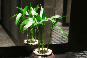
Monochromatic combinations
Using different shades of the same color creates a clean and elegant effect. For instance, layering light blue with deeper blue tones builds depth without overwhelming the eye.
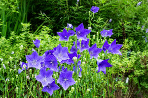
Complementary colors
Colors opposite each other, such as purple and yellow, create contrast and draw attention. This approach works well when you want the arrangement to stand out.
Analogous colors
Colors that sit next to each other, like pink, coral, and orange, produce a smooth and natural transition, ideal for a relaxed and harmonious feel.
Each method offers a different visual rhythm, and choosing the right one depends on the intended mood.
Creating Specific Atmospheres
Color combinations directly influence how an arrangement is perceived in a space. By adjusting tones and contrasts, you can shape distinct atmospheres.
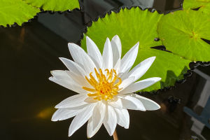
A fresh and airy feeling often comes from light colors such as white, pale green, and soft lavender. These combinations reflect light well and make spaces feel open.
A warm and inviting atmosphere can be achieved through layered tones like terracotta, peach, and golden yellow. These colors add depth and a sense of comfort, especially in shared living areas.
For a calm and grounded effect, deeper shades like muted blue, soft gray, and dark green work together to reduce visual noise and create a steady presence.
Balancing Color Proportions
Even the best color choices can fail if proportions are not controlled. Too many strong tones competing for attention can make an arrangement feel chaotic.
A practical approach is to assign roles to colors:
Dominant color
This is the main tone that defines the overall look.
Supporting color
Used to enhance and complement the dominant shade.
Accent color
A small amount of contrast added to create visual interest.
For instance, a bouquet may use soft cream as the base, light green as support, and a touch of deep burgundy as an accent. This layered approach keeps the design structured and intentional.
Adapting to Space and Lighting
Color does not exist in isolation—it interacts with its surroundings. Lighting conditions and background elements can change how colors appear.
In bright environments, lighter tones may appear washed out, so slightly stronger shades help maintain presence. In dimmer settings, softer colors prevent the arrangement from feeling too heavy.
Additionally, consider nearby furniture or wall colors. A well-matched arrangement can either blend seamlessly into a space or act as a subtle highlight without clashing.
Final Thoughts
Floral design is often seen as intuitive, but color pairing reveals the thoughtful decisions behind each arrangement. By understanding emotional impact, harmony principles, and proportion, you gain control over how a bouquet communicates.
In the end, color is not just decoration—it is a tool for expression. When used with intention, it transforms flowers from simple elements into a quiet yet powerful presence, shaping the atmosphere of everyday life in ways that feel both natural and deeply considered.